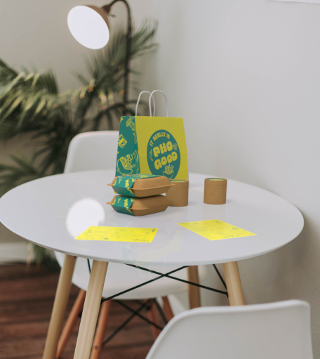

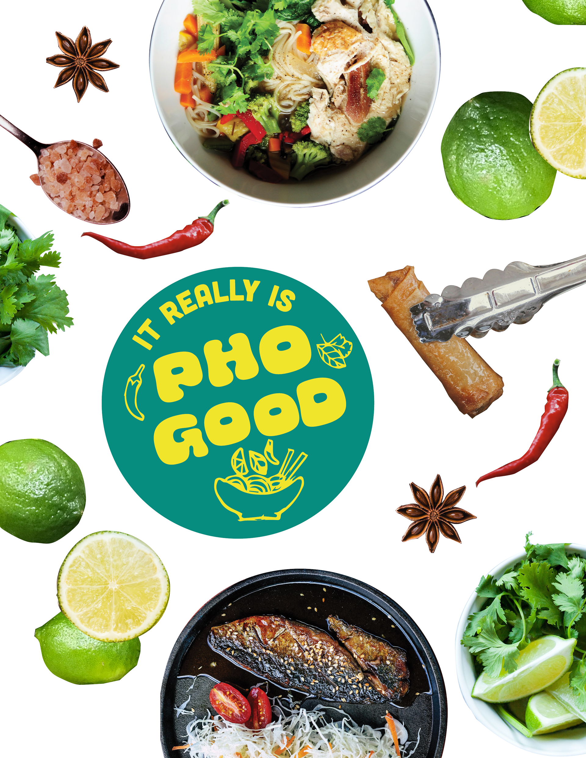
This is a fun rebrand I did for a class project using an existing local restaurant, Pho Good. The existing brand was super simple with a slab serif font and bowl of pho for a logo. The colors were originally just white and blue (harkening to the simple bowls you might find a pho spot), but it didn't capture the vibrancy of flavor, focus on raw/natural ingredients, and didn't do much to help unpack the flavors you'd experience in each dish.
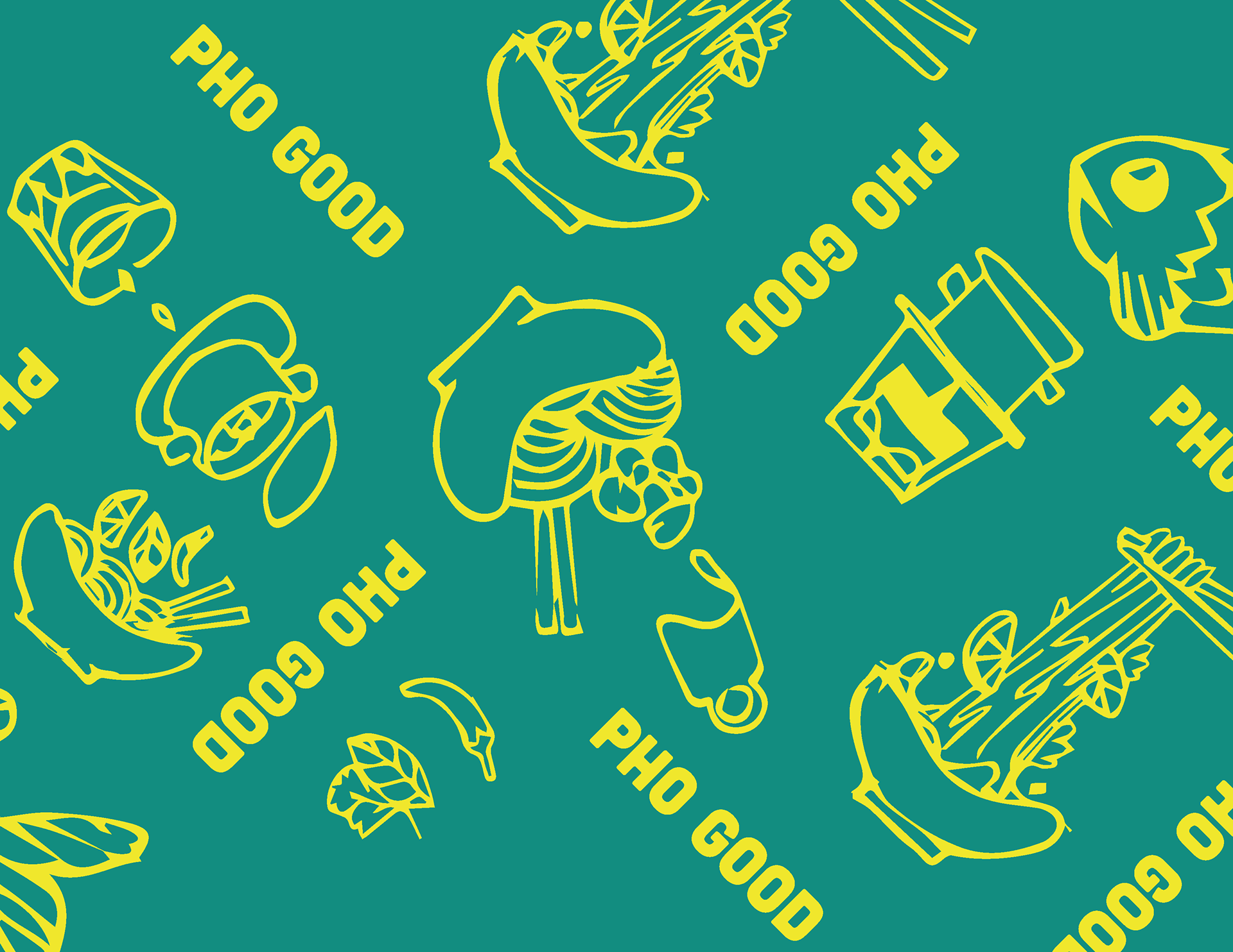
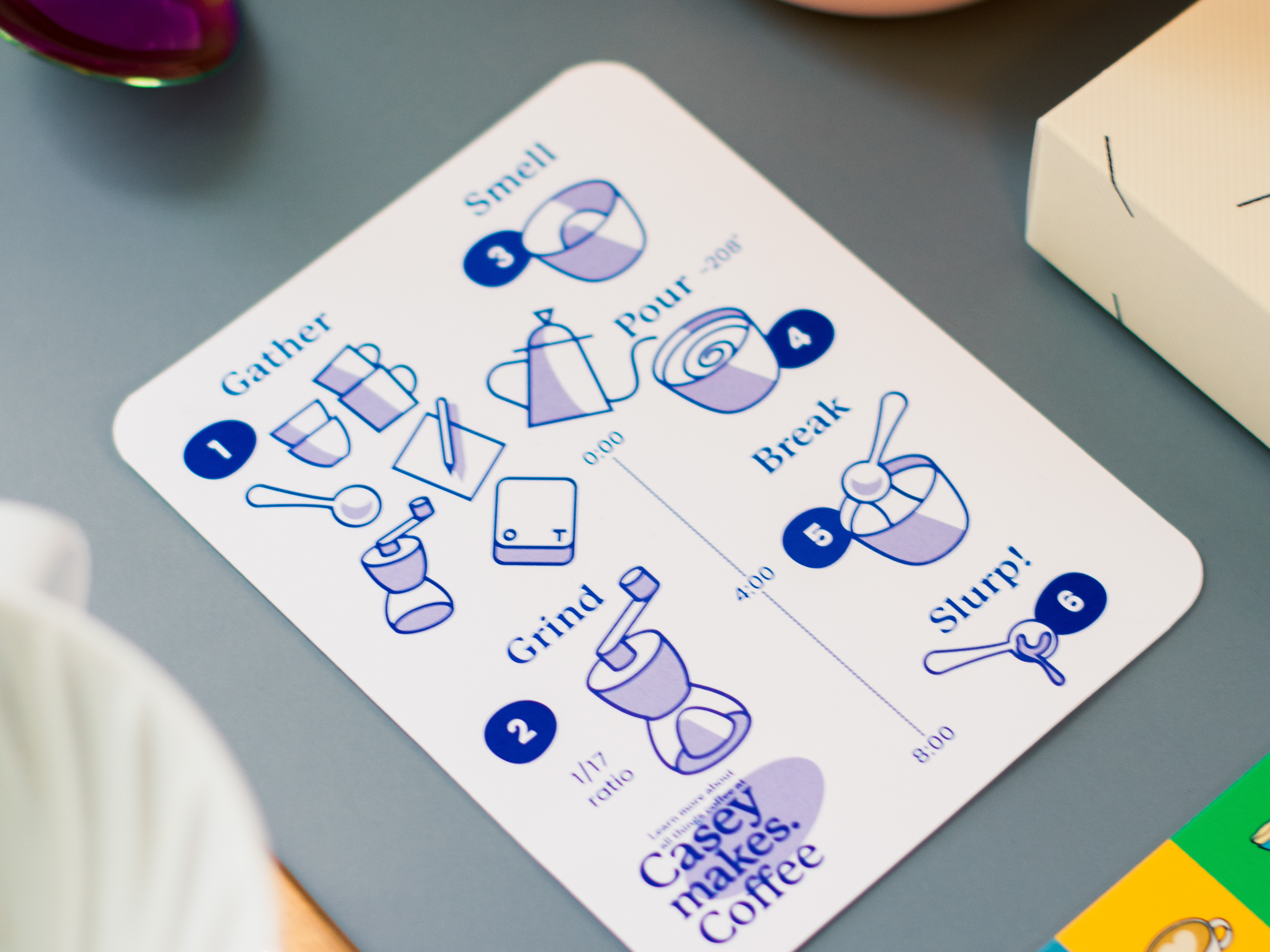
I doodled some fun versions of the menu items to use for instruction but also to fill space in branding.
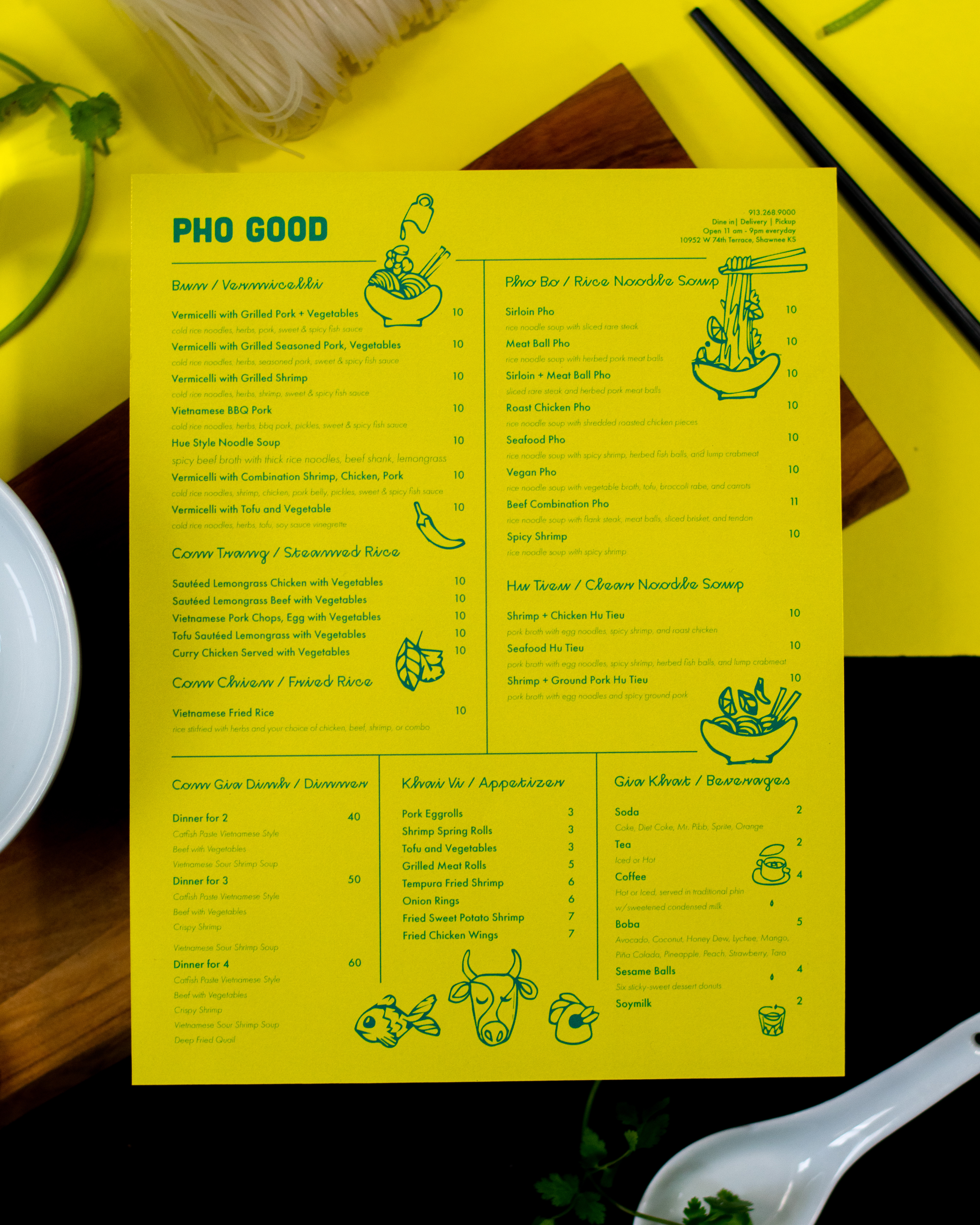
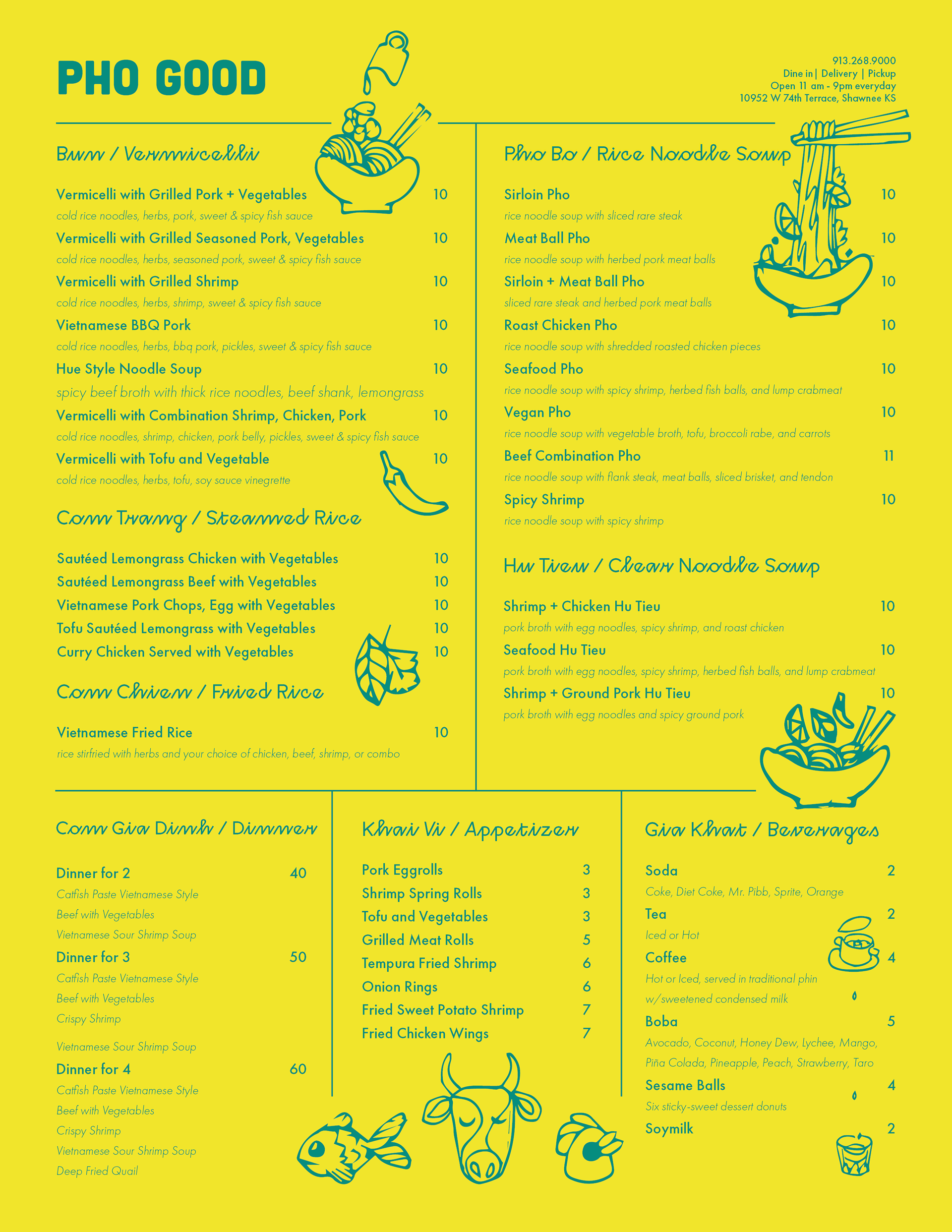
I did both a physical mock-up and digital one using Dimension. The organization on the menu combined with the illustrations helps guide the guest through the different types of meals. Also, it's printed on a paper that is sealed and can be sanitized without needing to be laminated - saving on money while still thinking about the safety of the guests.