FAB! is an heirloom bean provider with a goal of providing unique and delicious beans and bean products to a growing market around the globe.
The objective of this project was to create a visual identity that established and communicated our proposed brand's values, audience, and context. This presentation includes the touch points created around FAB! as well as some of the information about our target audience. Our group has created a loud, energetic, and exciting identity around a product that exists in a typically monotonous market.
If you're interested in seeing some of the process work that went behind this making of this project, click here.
This project was completed alongside Megan Towle and Jack Raybuck.
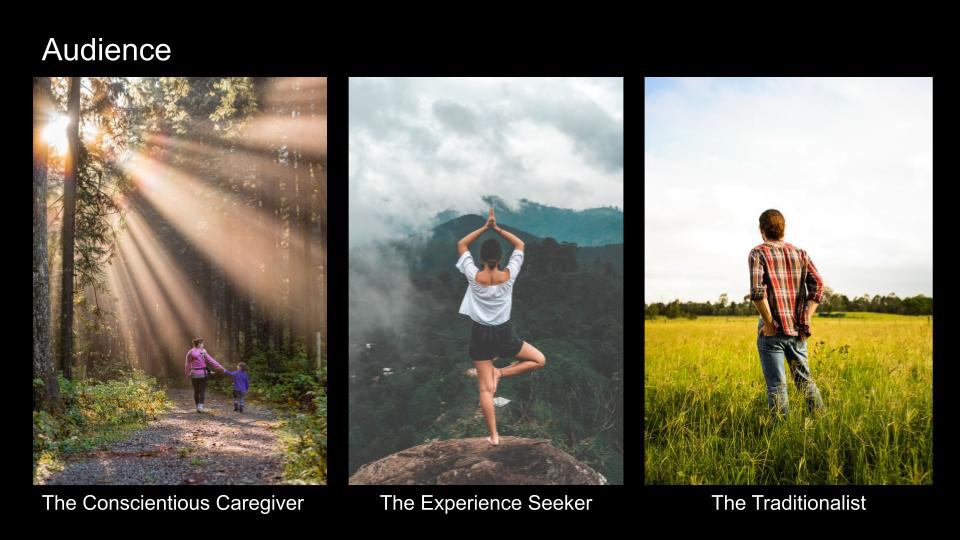
Our target audience for FAB! includes three different demographics: The Conscientious Caregiver, The Experience Seeker, and The Traditionalist. Identifying these core audience groups provided us with a clearer understanding on our position and messaging within the market. Empathy maps were created in order to determine these groups, and the goal was to focus our marketing efforts towards those who we believe would engage with the offerings.
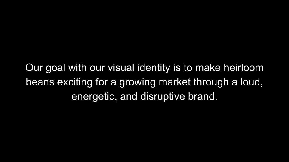
As stated above, the goal of our visual identity was to create something new in a growing market. Beans are a food group that have grown in popularity over the last few years, and the consumer need for more authentic and culturally-diverse tastes further expands the potential opportunity for a brand like FAB! With a loud, energetic, and disruptive identity, FAB! positions itself as the most exciting bean-product brand on the market.
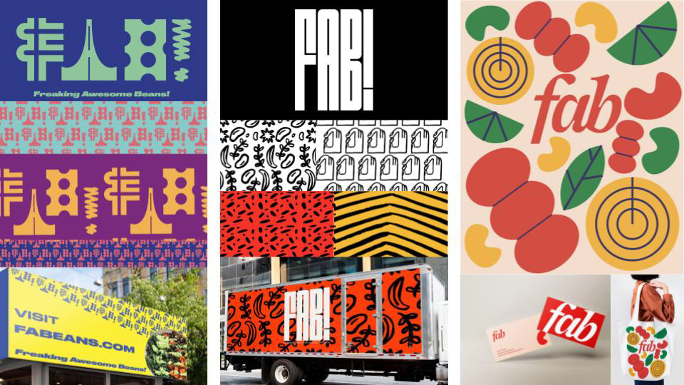
Above are our initial explorations for different visual language options. We knew we wanted to create something that would feel completely different from the current offerings in the market, and working through this process allowed us to explore differences in color, patterning, and overall language to create the most impactful brand in this space. Each direction is an attempt to say the same things, the challenge for our group was selecting the one that spoke in the voice most aligned with where we wanted our brand to exist.
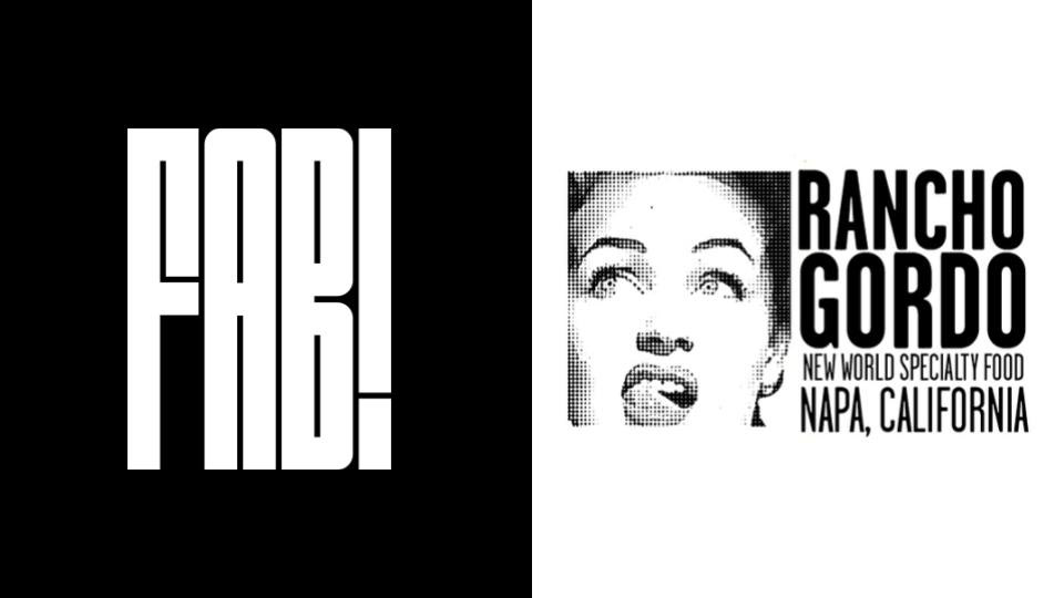
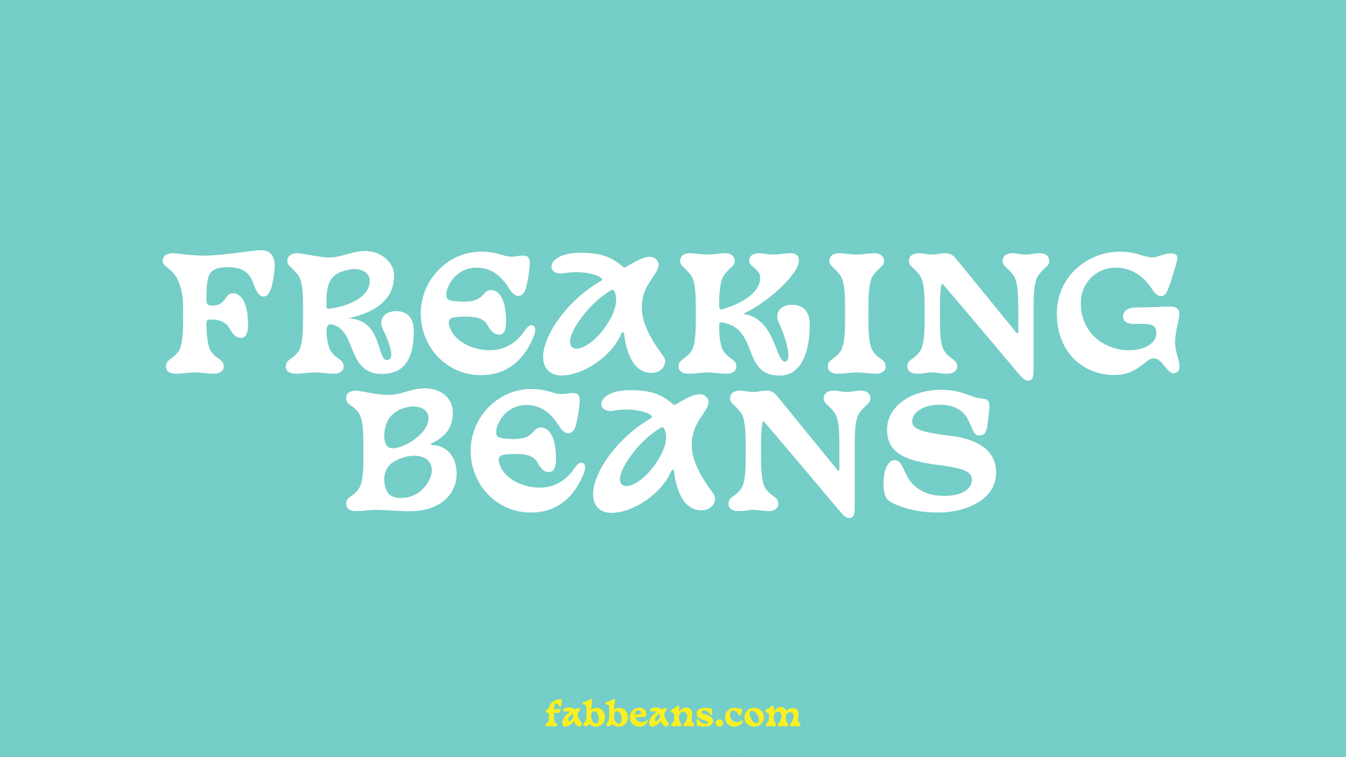
Shown here is our final wordmark in black and white, next to the market's largest provider of bean-based products. The goal was to create something loud and filled with energy, while differentiating itself from the competition. We've taken the traditional bean brand and infused it with life, spirit, and power. The wordmark demands the consumer's attention, and stands out among other brands occupying similar "shelf space."
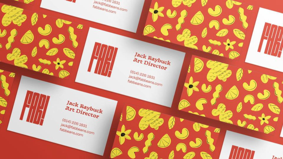
FAB! business cards reflect the identity that we aimed to create around the brand. We've made something that aligns with our brand attributes (loud, energetic, disruptive) while still remaining legible and easy to engage. It was important that the touch points created around FAB! evoked the feelings we were after, but were also functional in what they were meant to be.
FAB! business cards reflect the identity that we aimed to create around the brand. We've made something that aligns with our brand attributes (loud, energetic, disruptive) while still remaining legible and easy to engage. It was important that the touch points created around FAB! evoked the feelings we were after, but were also functional in what they were meant to be.
The print campaign utilizes real photography of both our partnering farmers and authentic bean-based dishes to highlight both the emotional and functional aspects of our offerings. The goal here was to create print advertisements that use color and imagery to engage passersby and generate brand awareness.
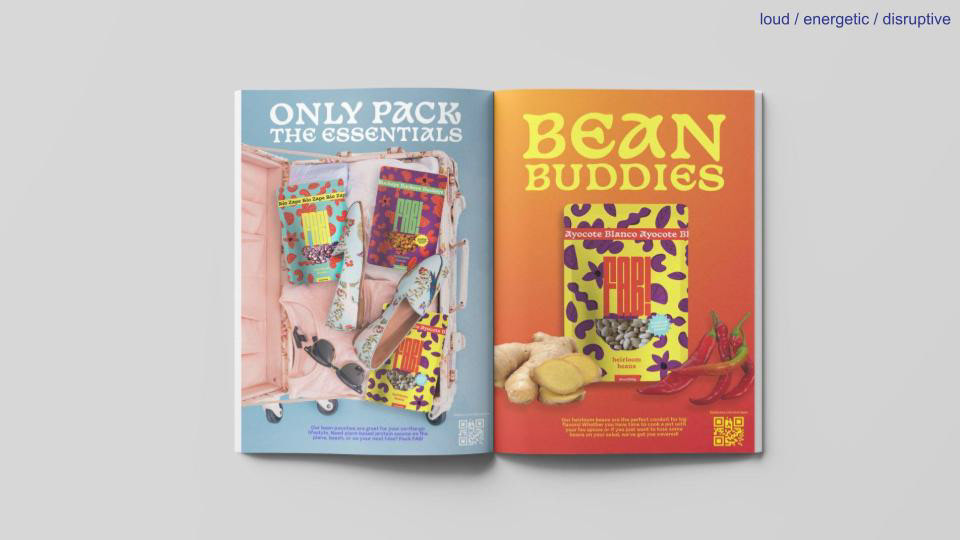
Print advertisements that could appear in magazines read by our target audiences. These ads use the brand's messaging and voice to create fun, exciting, and energetic graphics in support of the brand's market position.
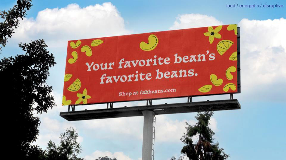
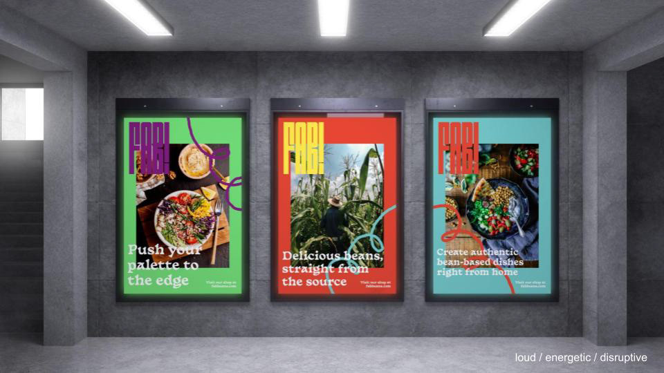
Large-scale environmental graphics grab the attention of potential customers, and utilize the brand's messaging and voice to engage. Graphic in nature, the billboards are easy to digest and serve as an entry to the brand's identity.
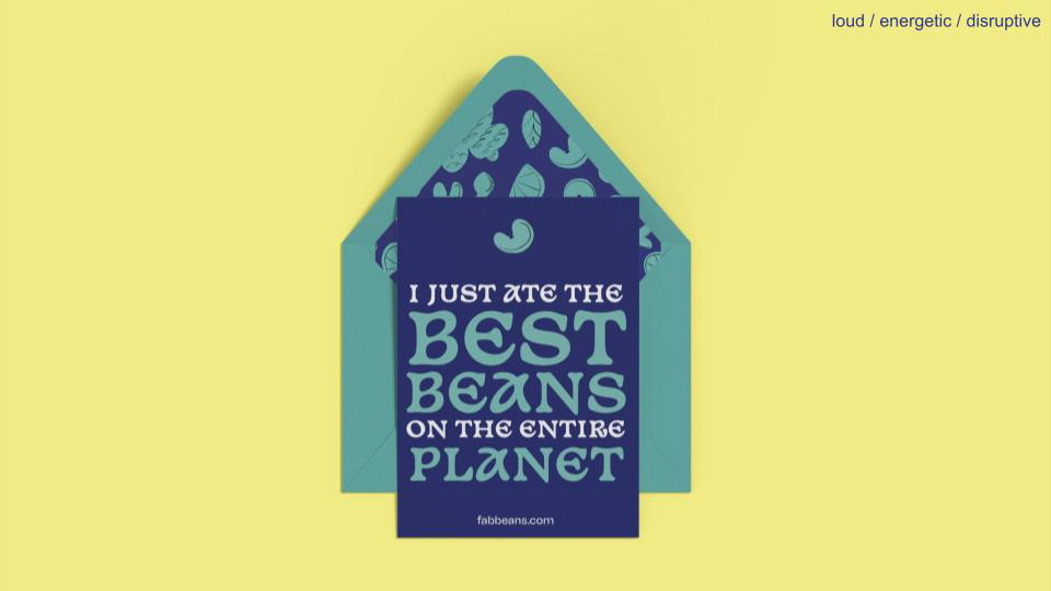
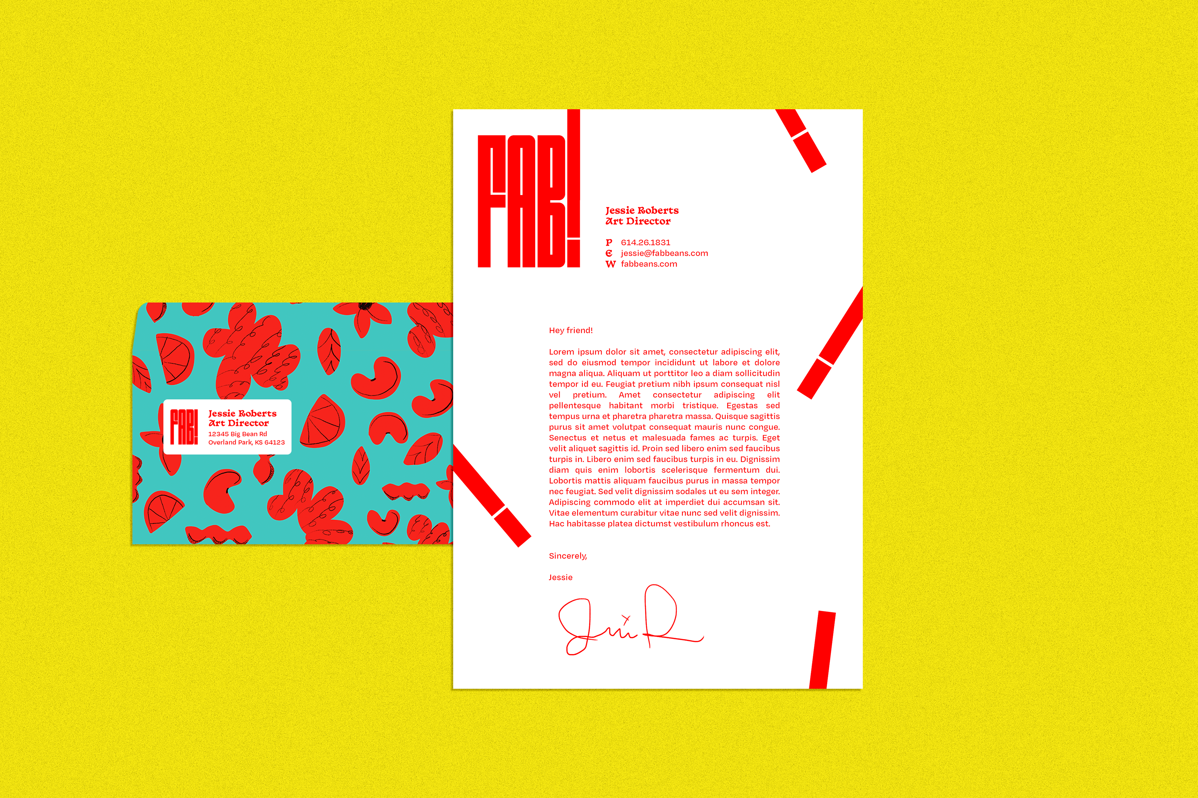
FAB! branded thank you cards for existing and potential customers. The messaging and voice of the cards plays into the identity of the FAB! brand, and lets customers know why they continue to shop with us.
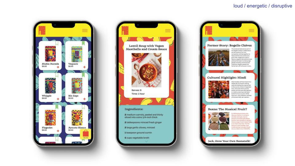
A FAB! app provides customers the opportunity to both shop and learn about the products from their phones. Not only do users have the convenience of purchasing FAB! products from wherever they are, but they can also learn about dishes they can cook using our beans as well as the places in the world they came from. Leveraging the FAB! app allows us to educate our consumers and strengthen brand trust.
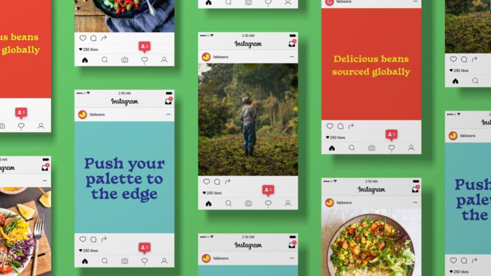
In creating social posts around the brand our goal was to highlight our partnering farmers who help bring bean to table, showcase delicious food dishes that could be created using FAB! products, and utilize our brand's messaging to engage users.
Motion graphics around the brand offer another way to further strengthen the personality of FAB! Using our messaging strategy and the F.A.B. acronym, we came up with a series of "A" adjectives to describe our offerings. These taglines can be used across digital, print, and motion-based collateral, and offer a dynamic and flexible copy option for advertisements.
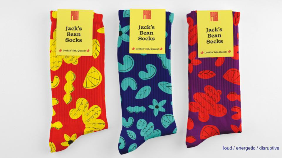
For our most loyal customers, FAB! has created a line of playful merchandise to carry-on the messaging and identity of the brand. Shown here are a few of the sock options that FAB! customers can choose from. Not only is it an easy way to show support for a brand doing good, but they're also comfortable and fun!
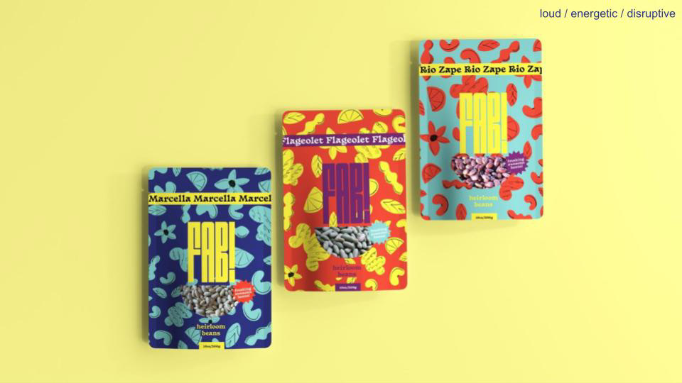
FAB! bean packaging takes visual cues from the overall brand identity. Bright and contrasting colors, large type and energetic patterns make FAB! products impossible to miss. Compared to the competition, FAB! positions itself as the bean brand that is truly excited about the future of the market.