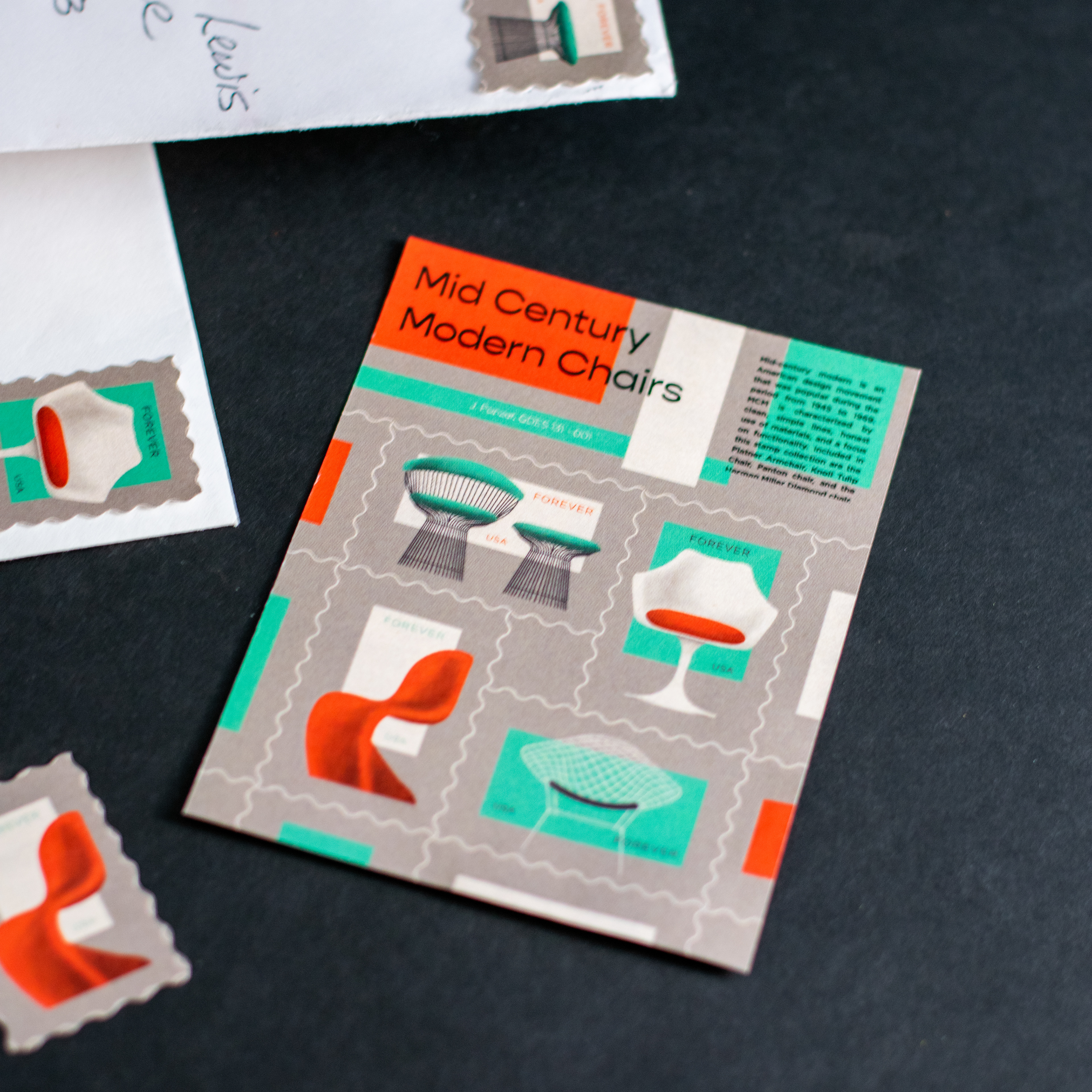
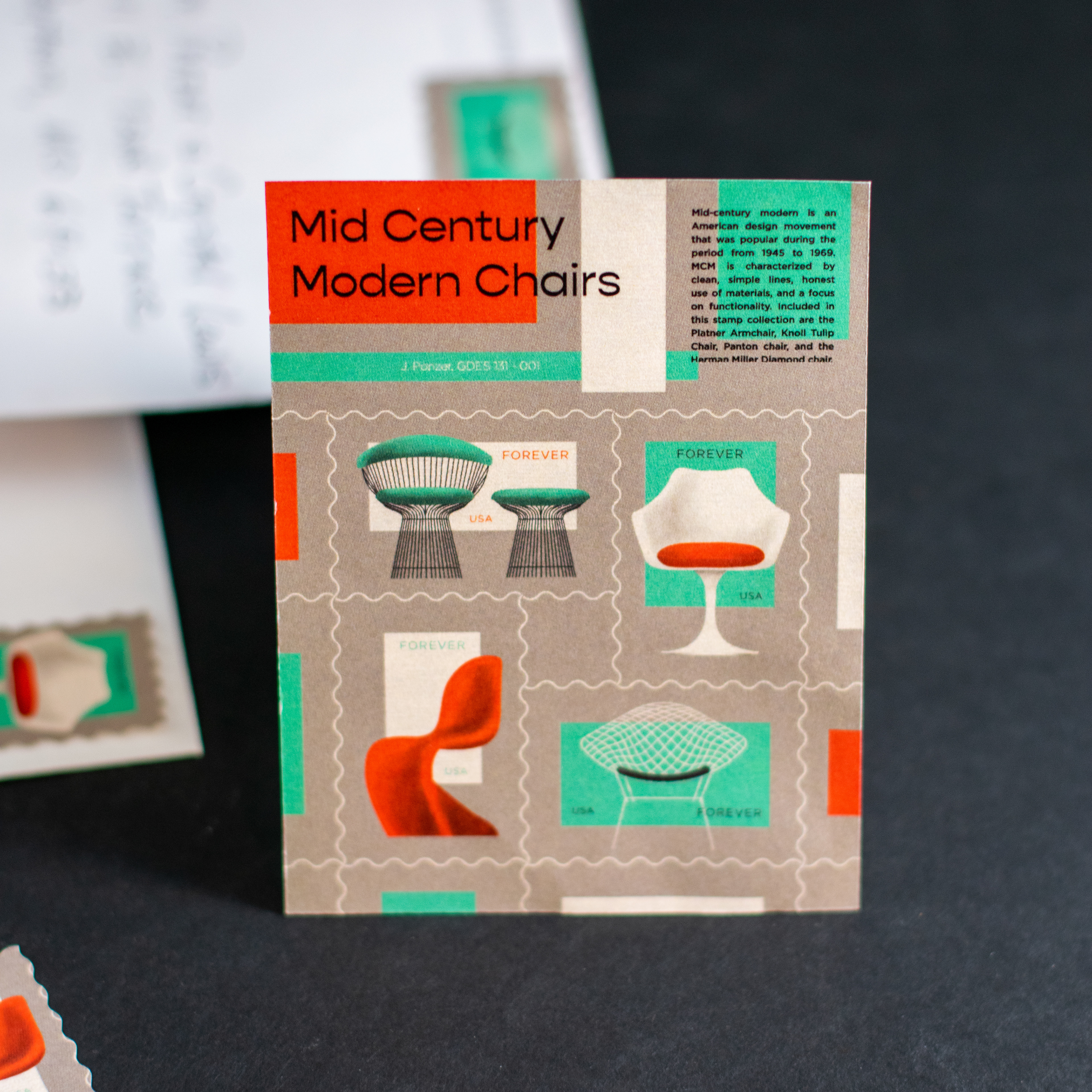
Here's a stamp set I designed for a class that turned out pretty good! I chose mid-century modern chairs as the theme and made a little card like you'd get from the post office. Here's a link to my Dropmark if you'd like to heck out my inspiration. I was influenced by the texture, fonts, colors, and shapes from mid century prints, but I didn't want the end piece to look cartoonish or silly. Copy is modified from Wikipedia.
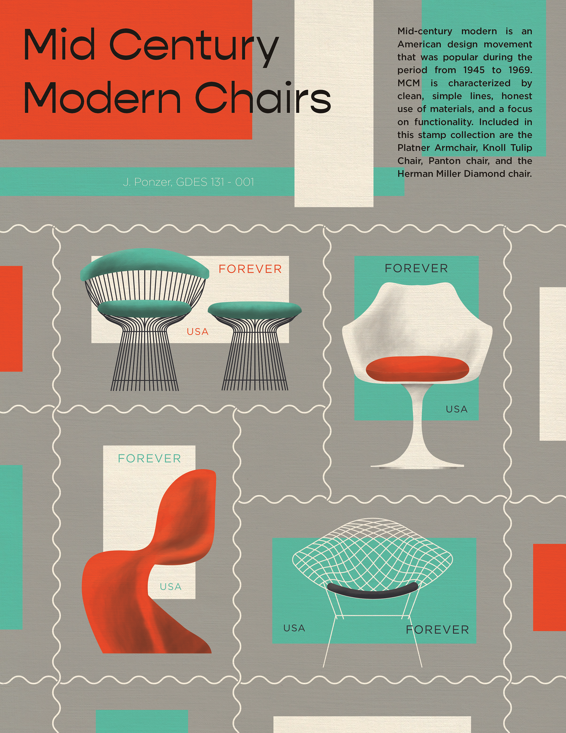
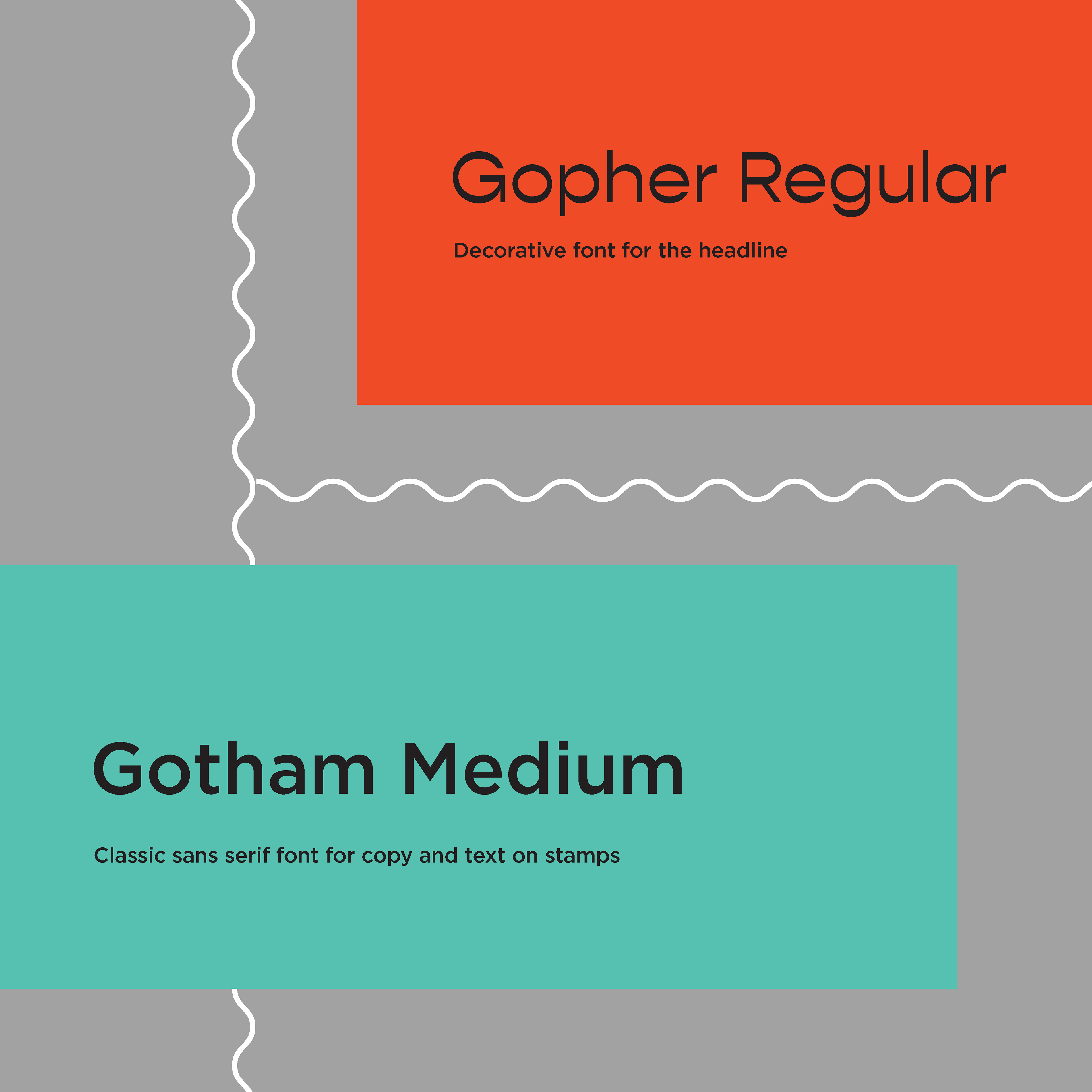
I used a paper texture to give the stamps a retro feel. I chose a funky decorative font for the headline and a classic san serif font with lots of variation for all of the other text. I printed them out and put them on some envelopes for a real-life mockup.